This is a cross-post from the digitalian
When building regular web pages we don’t often use absolute positioning in CSS. Recently, though, while building the layout for a one page web application I have been playing around with, I wanted to divide the page in three distinct areas:
- a fixed header DIV at the top of the page,
- a fixed footer DIV at the bottom of the page,
- a content DIV that would stretch between the header and the footer, using the entire space no matter how much content was placed in it.
After some research, I stumbled into a CSS feature (trick?) that allows to easily stretch a DIV vertically by explicitly setting both the top and bottom properties at the same time.
Here is the CSS:
/* The html and body elements cannot have any padding or margin. */
html,
body {
    width: 100%;
    height: 100%;
}

.container {
    width: 100%;
}

/* rows and columns */
.onepage-row, .onepage-col {
    overflow: hidden;
    position: absolute;
    border-radius: 0;
}
.onepage-row { left: 0; right: 0; }
.onepage-col { top: 0; bottom: 0; }
.onepage-scroll-x { overflow-x: auto; }
.onepage-scroll-y { overflow-y: auto; }

/* define header, content and footer areas */
#onepage-header { height: 50px; top: 0; }
#onepage-content { top: 50px; bottom: 50px; }
#onepage-footer { height: 50px; bottom: 0; }
Every onepage-row DIV stretches horizontally from the left edge to the right edge by using left:0 and top:0.
In the HTML (see below) I placed three onepage-row DIVs one on top of the other, and then I positioned them as follows:
#onepage-header { height: 50px; top: 0; } — this anchors the header at the top and sets the height of the header to 50px
#onepage-footer { height: 50px; bottom: 0; } — this anchors the footer at the bottom and sets the height of the footer to 50px
#onepage-content { top: 50px; bottom: 50px; } — this stretches the content DIV all the way from the bottom of the header to the top of the footer, even when no content is placed within it.
<body>
<div class="navbar-inverse onepage-row" id="onepage-header" role="navigation">
    <div class="container">
        <div class="navbar-header">
            <a class="navbar-brand" href="#">header</a>
        </div>
    </div>
</div>
<div id="onepage-content" class="onepage-row">
    Lorem ipsum dolor...
</div>
<div id="onepage-footer" class="onepage-row">
    <div class="container">
        <p>This is a sticky footer</p>
    </div>
</div>
This is the result:
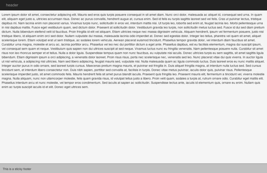
I have given the content DIV a light gray background color so that it is obvious that the DIV stretches all the way from the header to the footer even though the content doesn’t fill up all the space.
Next, I wanted to divide the content DIV into two areas:
- a right sidebar of fixed size on the right
- a main DIV that should use the entire available space on the left
First, I inserted a DIV inside the content DIV with position set to relative. This allows me to place other DIV inside of it in absolute mode, resetting the top / bottom / left / right properties to the container, instead of the browser window.
/* new absolutely positioned rows and columns can be placed relative to this container */
.relative-to-this {
    position: relative;
    width: 100%;
    height: 100%;
}

/* define main content area and right sidebar */
#onepage-main { left: 0px; right: 400px; }
#onepage-right { width: 400px; right: 0px; }
Next, I used the same trick, this time horizontally. I added inside the relative container two onepage-col DIVs (which stretch from top to bottom of the relative container) and I positioned them as follows:
#onepage-right { width: 400px; right: 0px; } — this anchors the DIV to the right margin of the relative container and sets the width to 400px
#onepage-main { left: 0px; right: 400px; } — this stretches the main DIV from the left margin of the relative container to the left margin of the right DIV.
<div id="onepage-content" class="onepage-row onepage-scroll-x">
    <div class="relative-to-this">
        <div id="onepage-main" class="onepage-col onepage-scroll-y">
            Lorem ipsum dolor...
        </div>
        <div id="onepage-right" class="onepage-col onepage-scroll-y">
            Lorem ipsum dolor...
        </div>
    </div>
</div>
This is the result:
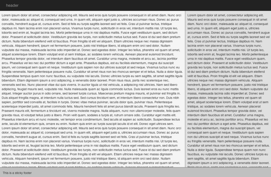
This time I also added to each DIV a onepage-scroll-y class to the two columns so that a scroll bar is automatically added when the content is longer than what can fit in the DIV.
Finally, I wanted to further subdivide the main content DIV into three columns of equal size. In order to achieve this, I first placed another relative-to-this DIV to reset again the top / bottom / left / right properties to the size of the main DIV.
/* divide the main content area in three columns of equal width */
.content-leftcol { left:0; width: 33%; }
.content-centercol { left: 33%; right: 33%; }
.content-rightcol { right:0; width: 33%; }
Next, I placed three onepage-col DIVs, which I positioned as follows:
.content-leftcol { left:0; width: 33%; } — this anchors the left column to the left margin of the relative container and sets the size of the column to 33% of the size of the relative container
.content-rightcol { right:0; width: 33%; } — this anchors the right column to the right margin of the relative container and sets the size of the column to 33% of the size of the relative container
.content-centercol { left: 33%; right: 33%; } — this anchors the center column to the left margin of the right column and to the right margin of the left column
            <div id="onepage-main" class="onepage-col onepage-scroll-y">
                <div class="relative-to-this">
                    <div class="content-leftcol onepage-col onepage-scroll-y">
                        Lorem ipsum dolor...
                    </div>
                    <div class="content-centercol onepage-col onepage-scroll-y">
                        Lorem ipsum dolor...
                    </div>
                    <div class="content-rightcol onepage-col onepage-scroll-y">
                        Lorem ipsum dolor...
                    </div>
                </div>
            </div>
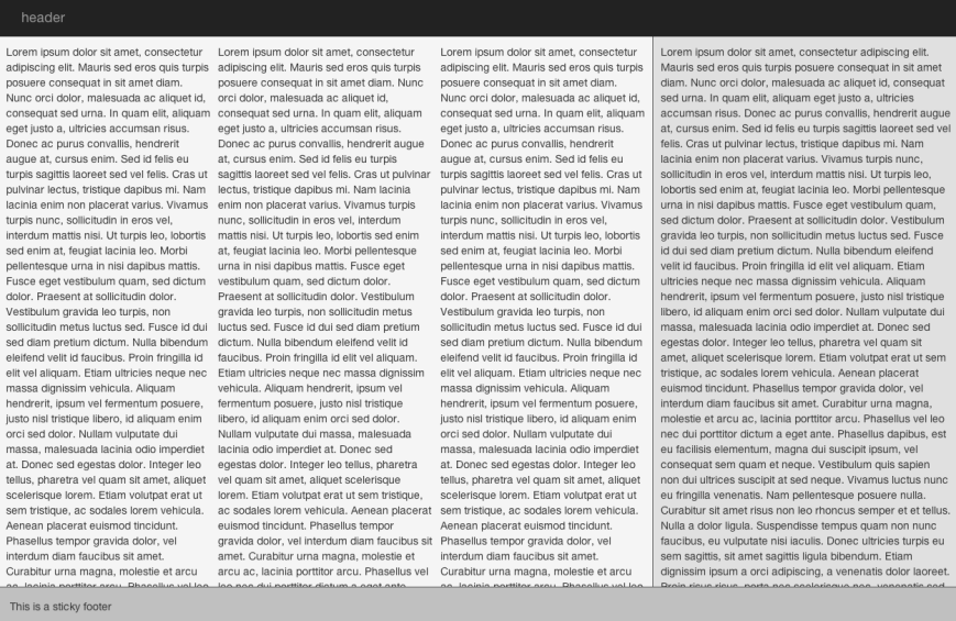
This is the final result:
For those of you who could be interest in playing with this as well, I “fiddled” the basic concept at http://jsfiddle.net/cy4RR/


 a thousand lines of code